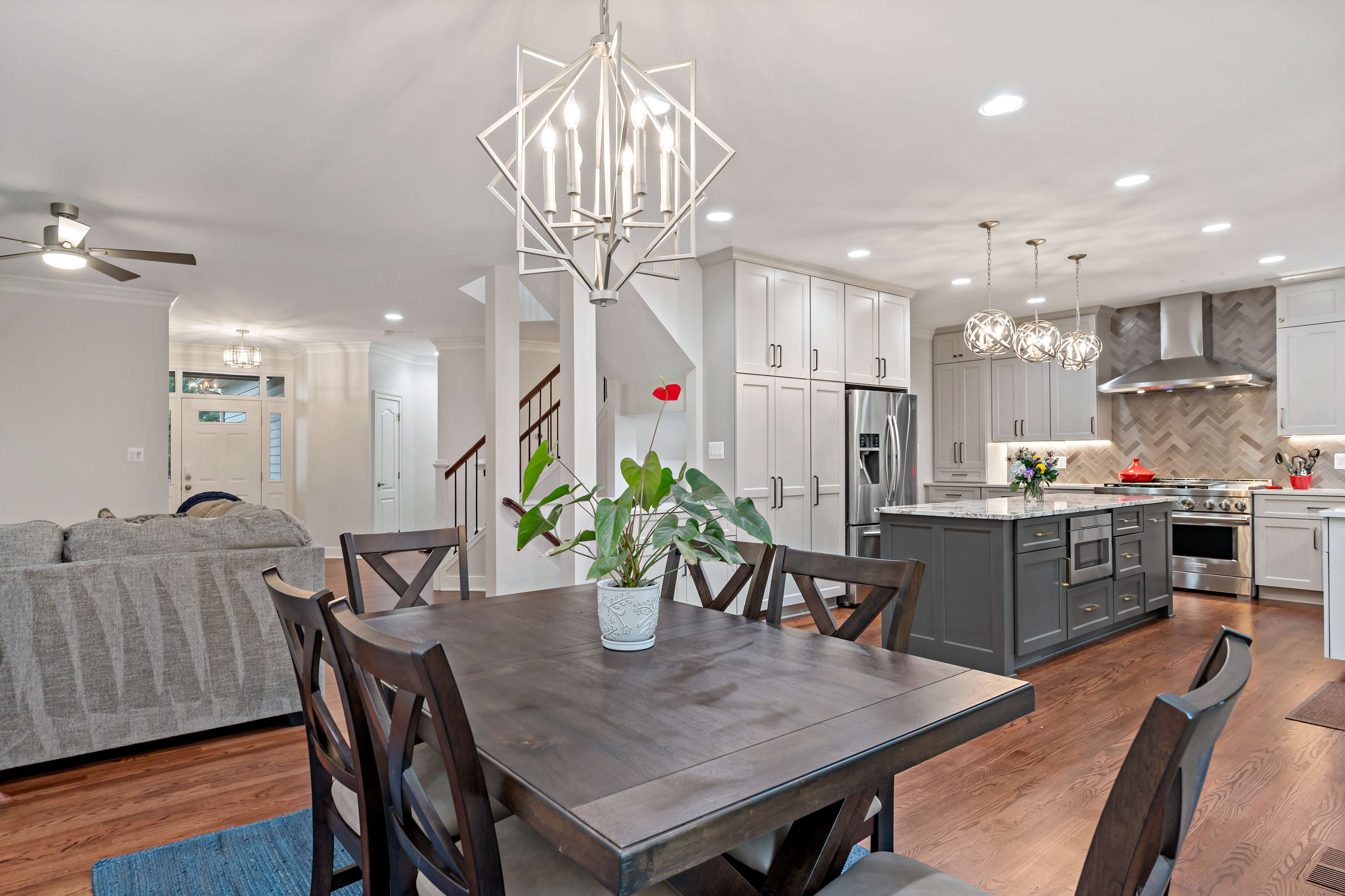
Here at MOSS, we love to showcase photos of homes we’ve remodeled so the artistry and craftsmanship of our team can be experienced by all. Even better is when we can also share photos of how residences looked before and during the remodeling timeframe, so the hard work that is shown at the end can be even more eye-catching. We recently completed an entire main floor interior remodel in a Reston home that encompassed the entire main level, including the crafting of a new staircase, removing walls, shifting doorway openings, totally overhauling the kitchen, and much more. It’s our pleasure to share the transformation of these many rooms from beginning to end, so that the care that goes into every project we undertake can be truly appreciated.
Entryway and Staircase
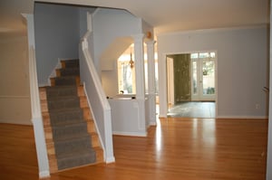
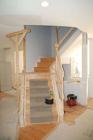
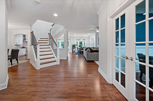
In its original iteration, the home’s staircase was closed off and traditional in design. Our customer wanted to have a more contemporary look for the entire main level and knew that the staircase had to be changed to show that off better. By removing the walls of the staircase and changing the balusters, as well as brightening up the color, the end result is a stunning, sophisticated and beautiful look.
Kitchen – View # 1
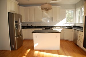
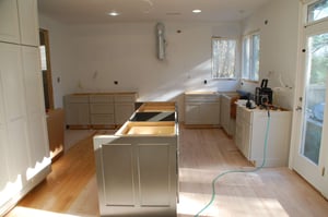
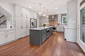
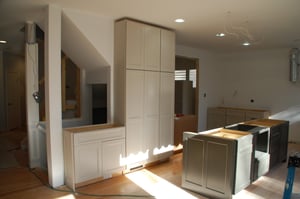
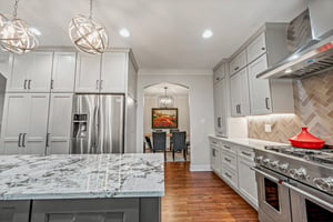
The home’s kitchen was originally very traditional with a small center island that wasn’t of much use to the homeowner. In addition, there was little functionality with the layout and a lack of using the space effectively and to its utmost possibilities. Our design team created a layout that allowed for more cabinetry throughout for better storage options, a long, quartz-topped center island for cooking and entertaining, and a shifted, larger opening to the dining room to allow for easier flow around the space.
Kitchen – View # 2
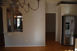
Adding full length cabinetry to the previously un-used adjacent kitchen wall gave the homeowner plenty of newfound storage and made better use of the kitchen’s footprint. The addition of more contemporary light fixtures above the island, as well as updated design features, including two-toned gray cabinets and a chevron tile backsplash, give the entire kitchen an updated look and feel. These photos also allow a glimpse into how MOSS shifted the entrance to the dining room from a doorway to a larger opening with an arched ceiling, which is a more welcoming and attractive design (as well as less clunky!).
Dining Room
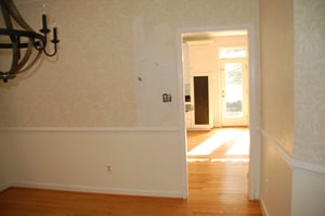
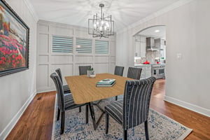
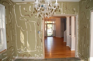
Originally, the home's dining room felt disjointed. MOSS suggested shifting the entrance from a doorway to an opening that was larger and with a distinct arched opening. Moving the doorway created a more open environment and to boot? The stunning handcrafted trim work by MOSS which completed the look.
Kitchen Nook
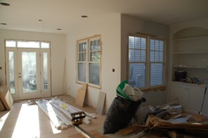
The home had a corner breakfast nook that was a separate room from the kitchen. MOSS suggested taking the walls away and opening the space to the rest of the main level. Shown here in its before, during, and after stages (angles shown here are different from one another) is the open and bright kitchen and eating area.

The remodeling process is a journey that we here at MOSS are proud to go on with our customers. With collaboration between our team members and the homeowners, a vision can come to reality through creativity, expert tradesmanship, and customers who believe in our process. To see more photos of this beautiful interior transformation in Reston, please visit the portfolio here.
